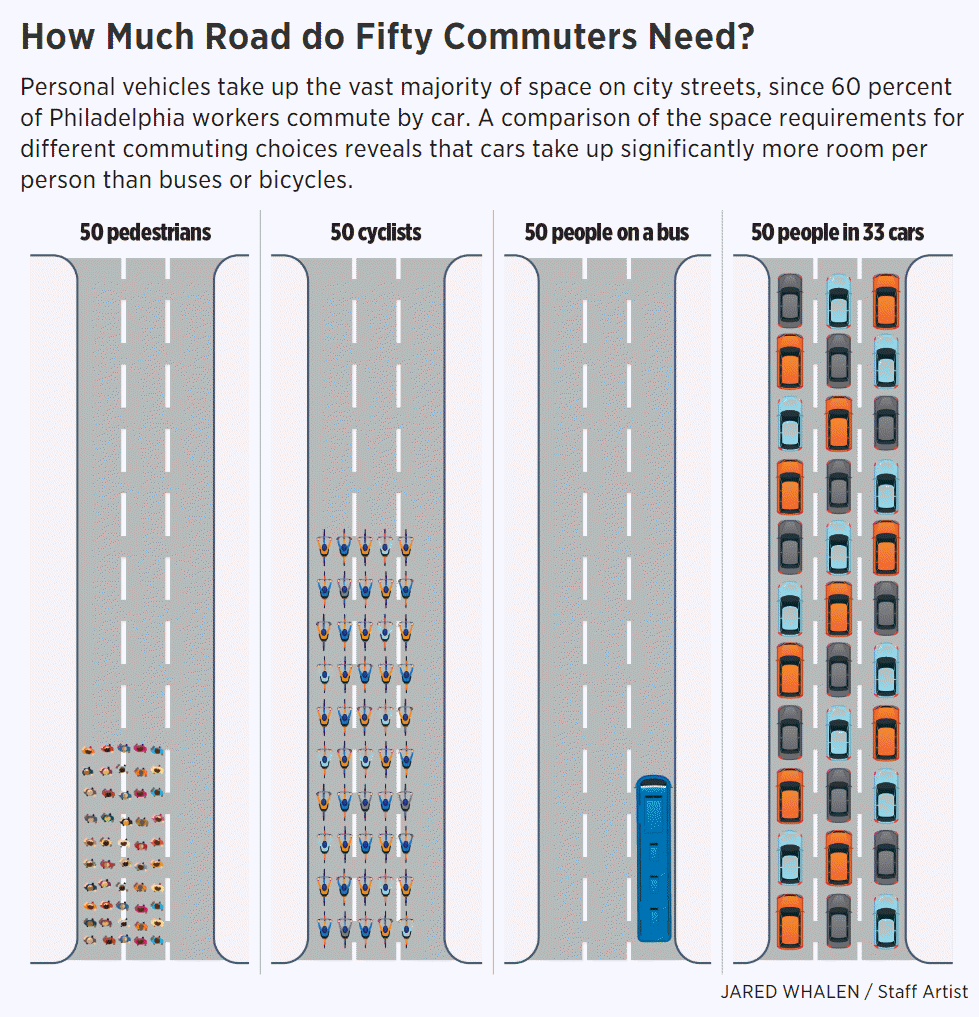
You’ve probably seen a graphic similar to this one that shows the road capacity and throughput given different modes of transport. This is often used to show support for public transit subsidies which perhaps some places should do more of.

Note that these type of images always the theoretical capacity if the bus was always full compared to the actual average number of passengers in cars (1.5 it seems). The visualizations would be much less impressive if it showed actually existing ridership levels for the alternate transit modes.
Another way to view this issue, though, is how many actual car trips are avoided by the existence of various modes and services? When viewed this way, of course, the bus is not that efficient at all especially when you realize that bus ridership cannibalizes bike and pedestrian usage at a significant rate. Anecdotally this happened almost overnight here in Chapel Hill/Carrboro when the buses went fare free several years ago. See this article about Finland resisting the urge to make public transit free for precisely this reason.
Which Produces Most Car Trip Replacement?

The service that I imagine is by far the most efficient in terms of reducing car trips is one that a lot of people typically complain about – the Amazon delivery truck. Of course they seem like they’re everywhere but you can fit a lot of packages in each one and I imagine Amazon is ruthlessly efficient at using the full capacity. You can fit far more packages in a truck than people in a bus and although not every package represents a car trip replacement I suspect that the ratio is quite strong. You’d also have to account for the fact that without Amazon we wouldn’t acquire quite as much stuff. Reviewing our own purchase history makes it clear to me that Amazon is reducing our family’s car trips.
If Amazon went away tomorrow, how many new car trips would emerge? A lot I bet. Has anyone seen any studies on this phenomenon?